
Roku Unveils Redesigned Home Screen for Faster Content Navigation
Roku continues to lead the charge in streaming innovation with its recent unveiling of a redesigned home screen, aimed at providing users with faster and more intuitive content navigation. This update enhances the user experience by streamlining access to favorite programs, movies, and shows while maintaining a user-friendly interface. In this article, we will delve into the historical context of Roku’s interface designs, explore the new features, and discuss what this means for the future of streaming.
A Historical Perspective on Roku’s Interface
Since its inception in 2008, Roku has continuously evolved to meet the changing demands of consumers. Initially launched as a simple streaming device, Roku’s interface has undergone several transformations, with each iteration focusing on user experience and accessibility.
The previous home screen design served its purpose well, but as the streaming landscape grew increasingly competitive, a need emerged for a more efficient and engaging navigation system. The latest redesign is a response to user feedback and the growing complexity of content offerings available on the platform.
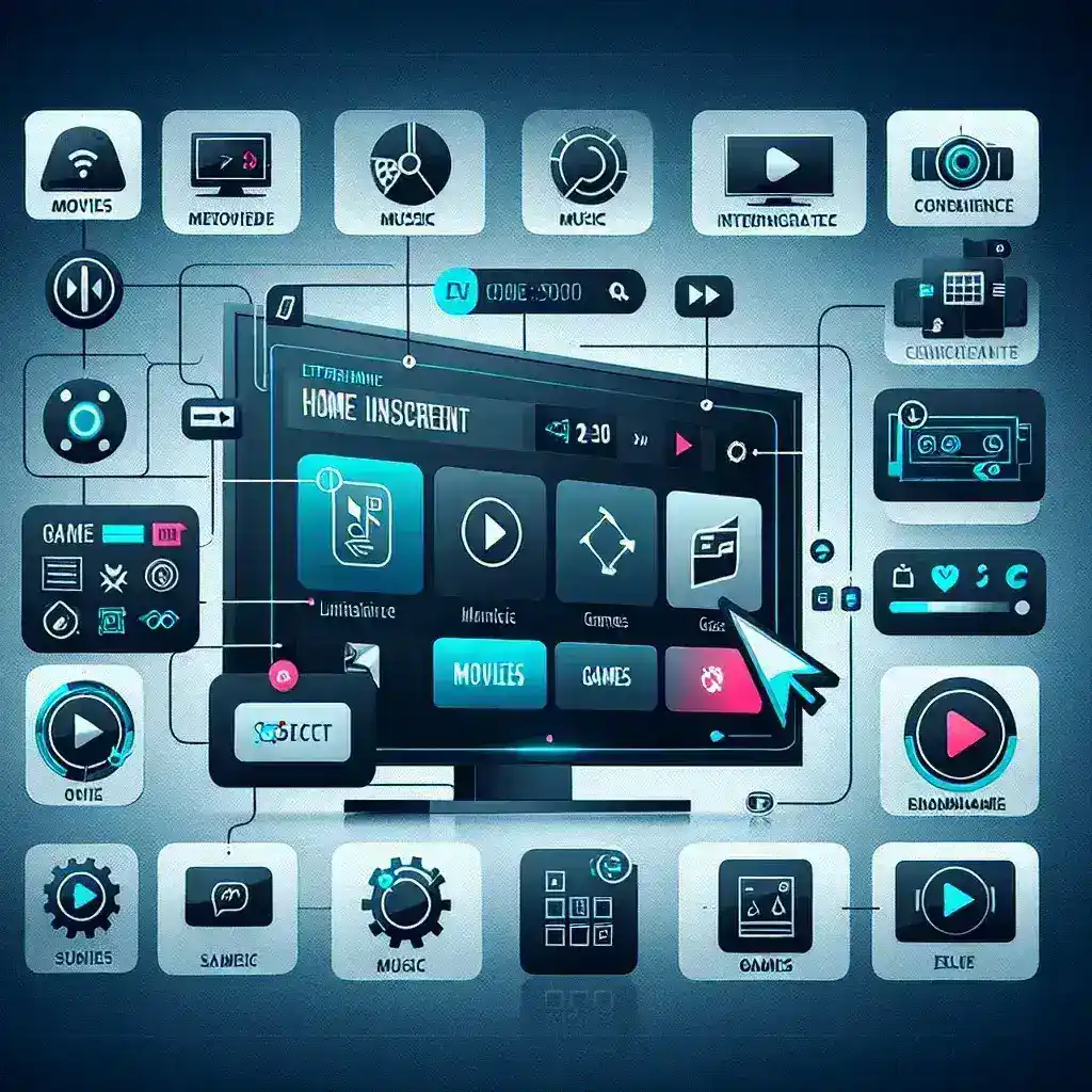
Key Features of the Redesigned Home Screen
The redesigned home screen is not just a cosmetic change; it introduces several innovative features that significantly enhance navigation:
- Personalized Content Recommendations: The new home screen utilizes advanced algorithms to offer tailored content suggestions based on viewing habits, making it easier for users to discover new shows and movies.
- Quick Access Menu: With the introduction of a quick access menu, users can now reach their preferred apps and channels without navigating through multiple layers, reducing the time spent searching for content.
- Improved Search Functionality: The search bar has been revamped, allowing users to find content faster. Voice search capabilities have also been enhanced, making it even easier to locate desired titles without typing.
- Live TV Integration: For users who enjoy live broadcasts, the new interface seamlessly integrates live TV channels alongside on-demand content, offering a comprehensive viewing experience.
- Enhanced Visual Design: The aesthetic overhaul features a more modern design with vibrant colors and intuitive icons, making navigation feel more dynamic and engaging.
How the Redesign Enhances User Experience
This new home screen design not only focuses on aesthetics but also on functionality. By prioritizing user feedback, Roku has ensured that the new interface addresses common pain points experienced by viewers.
For instance, the personalization aspect allows users to feel more in control of their viewing experience. With suggestions that reflect individual preferences, users are likely to engage more with the platform, leading to increased satisfaction and potential subscription renewals.
The quick access menu is another game-changer. It caters to the growing demand for instant gratification in content consumption. Users can access their favorite channels in seconds, enhancing the overall convenience of using the Roku device.
Future Implications for Streaming
As streaming services continue to proliferate, having a user-friendly interface will become increasingly crucial. Roku’s commitment to enhancing the user experience could set a benchmark for other streaming platforms, driving them to innovate and adapt.
Looking ahead, we can expect Roku to continue refining its platform based on user behavior and industry trends. Future updates may include even more integrated features, such as social sharing options or interactive content, further promoting user engagement.
Pros and Cons of the Redesign
As with any major update, the new Roku home screen comes with its own set of advantages and challenges:
- Pros:
- Enhanced user engagement through personalized recommendations
- Faster navigation leading to improved user satisfaction
- Modern design appealing to a wider audience
- Cons:
- Some users may require time to adapt to the new layout
- Potential bugs or glitches that might arise after the launch
Real-World Examples
After the rollout of the new home screen, early users have reported positive experiences. Feedback from users highlights the efficiency of the new design, with many noting how quickly they can access their favorite shows. One user stated, “The new layout feels like a breath of fresh air! I can find what I want without scrolling endlessly through menus.”
This sentiment is echoed across various platforms, with many users praising the enhanced search functionality. The ability to search for content using voice commands has proven particularly popular among families, where multiple users share a single device.
Conclusion: Embracing Change in Streaming
Roku’s unveiling of the redesigned home screen represents a significant step toward enhancing user experience in the competitive streaming landscape. By focusing on fast content navigation and personalized recommendations, Roku is not only meeting but exceeding the expectations of its users.
As technology continues to evolve, the demand for intuitive interfaces will only increase. Roku’s commitment to innovation ensures that it remains at the forefront of this changing landscape. As we look to the future, it will be exciting to see how the company continues to adapt and respond to the needs of its audience, further solidifying its place as a leader in home entertainment.